I still can’t believe how bad the Google Wallet redesign is
ترجمه فارسی این خبر هنوز آماده نشده است؛ متن زیر از منبع اصلی است.
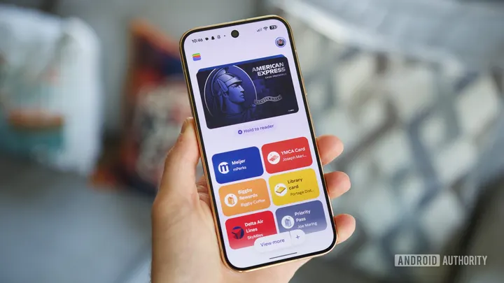
In early October, Google began rolling out a fairly big redesign to the Google Wallet app . After years of displaying credit/debit cards in a horizontal carousel, the app switched to a vertical list. On paper, this doesn’t sound like that big of a deal. If anything, it made the Google Wallet home screen look a bit cleaner and more organized. However, after living with this redesign for the past month, I can’t stand…
گزارش اصلی و جزئیات بیشتر در Android Authority.
مشاهده خبر در منبع اصلی